The Key to Floral Pixel Quilts: Choosing Colors That Actually Work
Color isn’t just decorative… it IS the design.
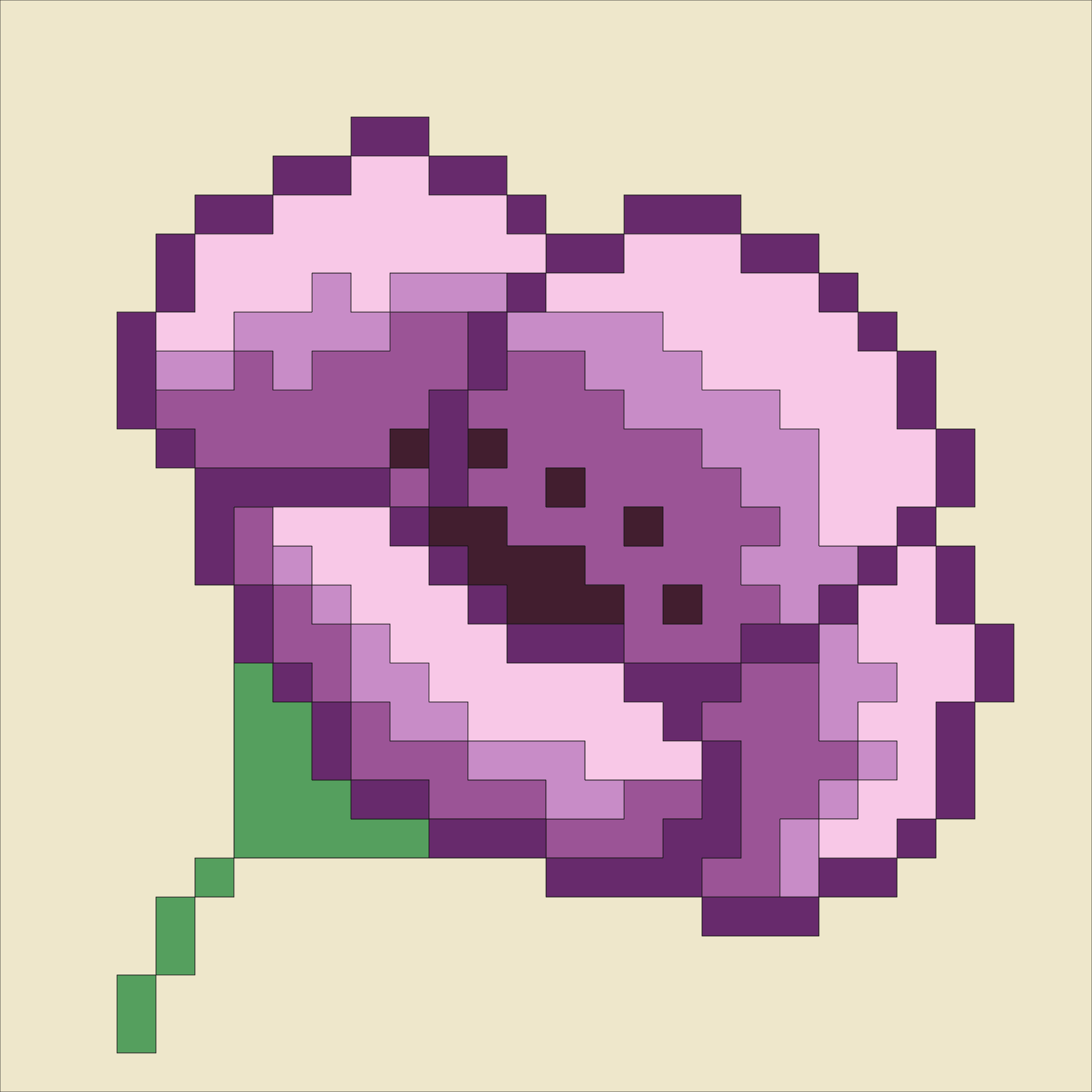
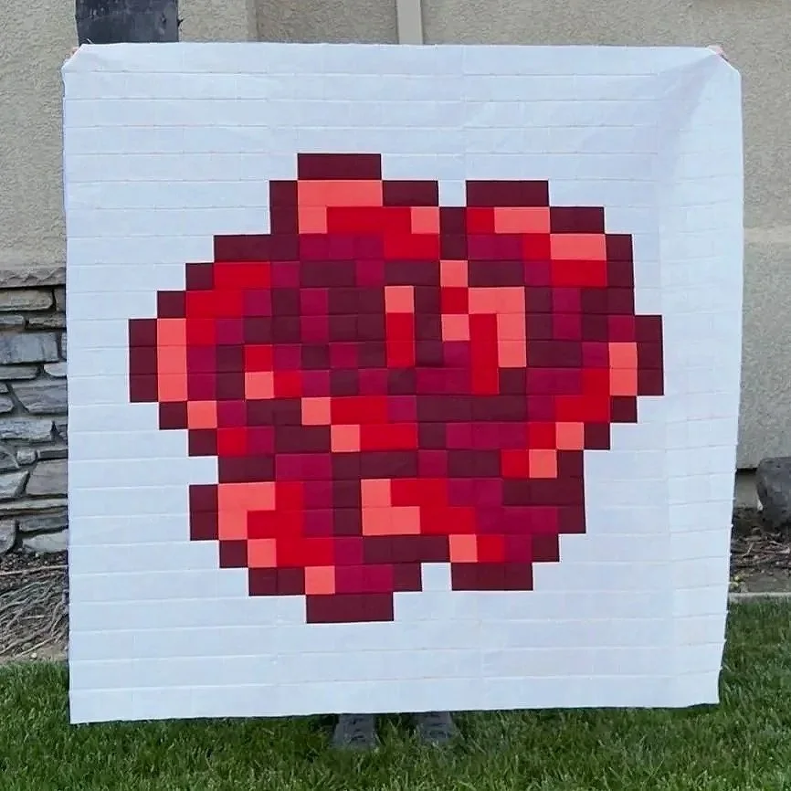
Unlike traditional quilting where shapes create movement, my floral pixel quilts rely on color value to define the image. That’s why choosing the right shades can make the difference between a crisp, recognizable flower and something that feels a little muddy.
Here are a few tips that will help you choose colors to create a defined, dimensional, and beautiful pixel quilt.
Value Matters More Than Color
Value (how light or dark a fabric is) is more important than the actual color.
The contrast is what gives your flower depth and makes the image readable.
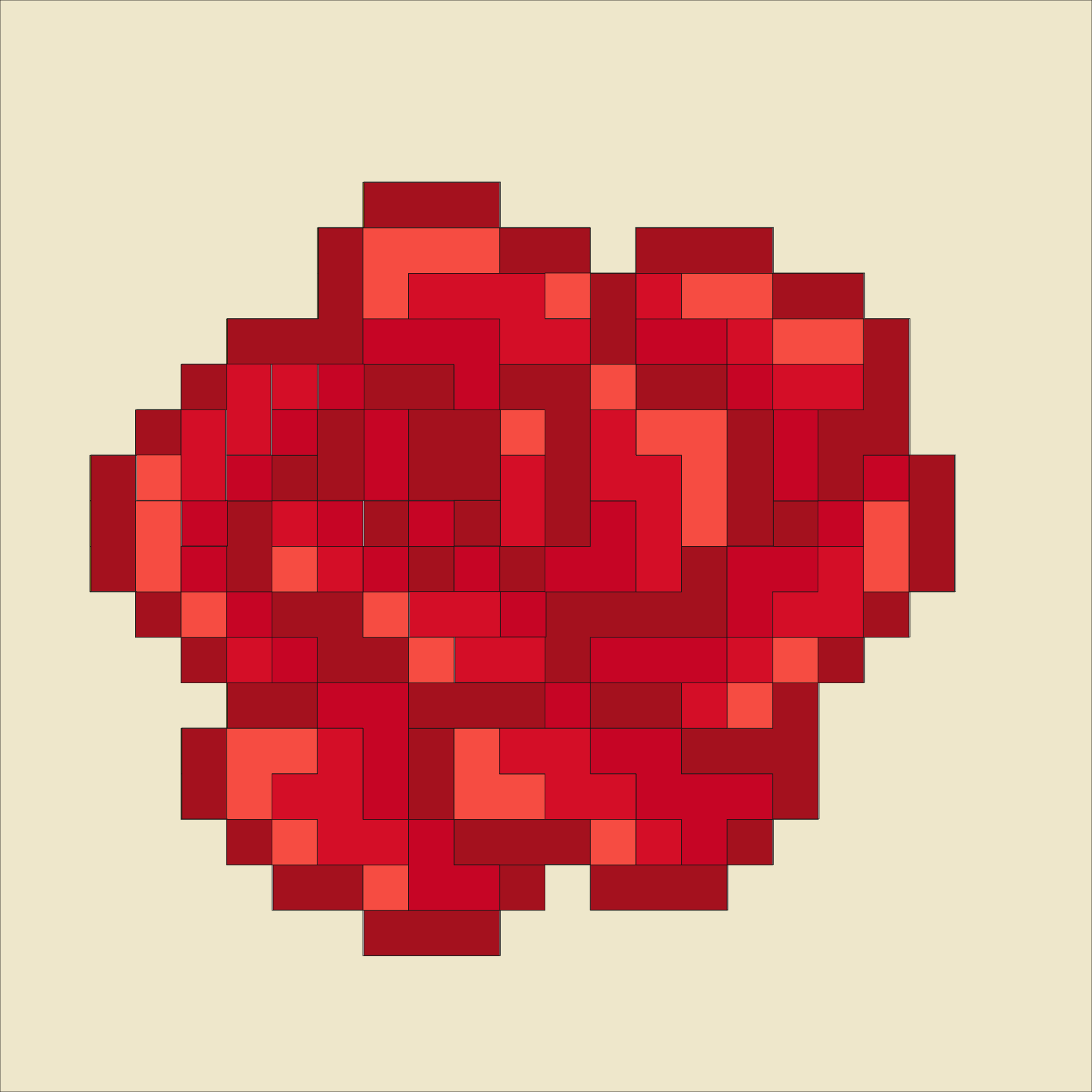
You can make a beautiful, cohesive flower using all one color— red, yellow, purple— but without enough contrast between light and dark shades, the design won’t stand out.
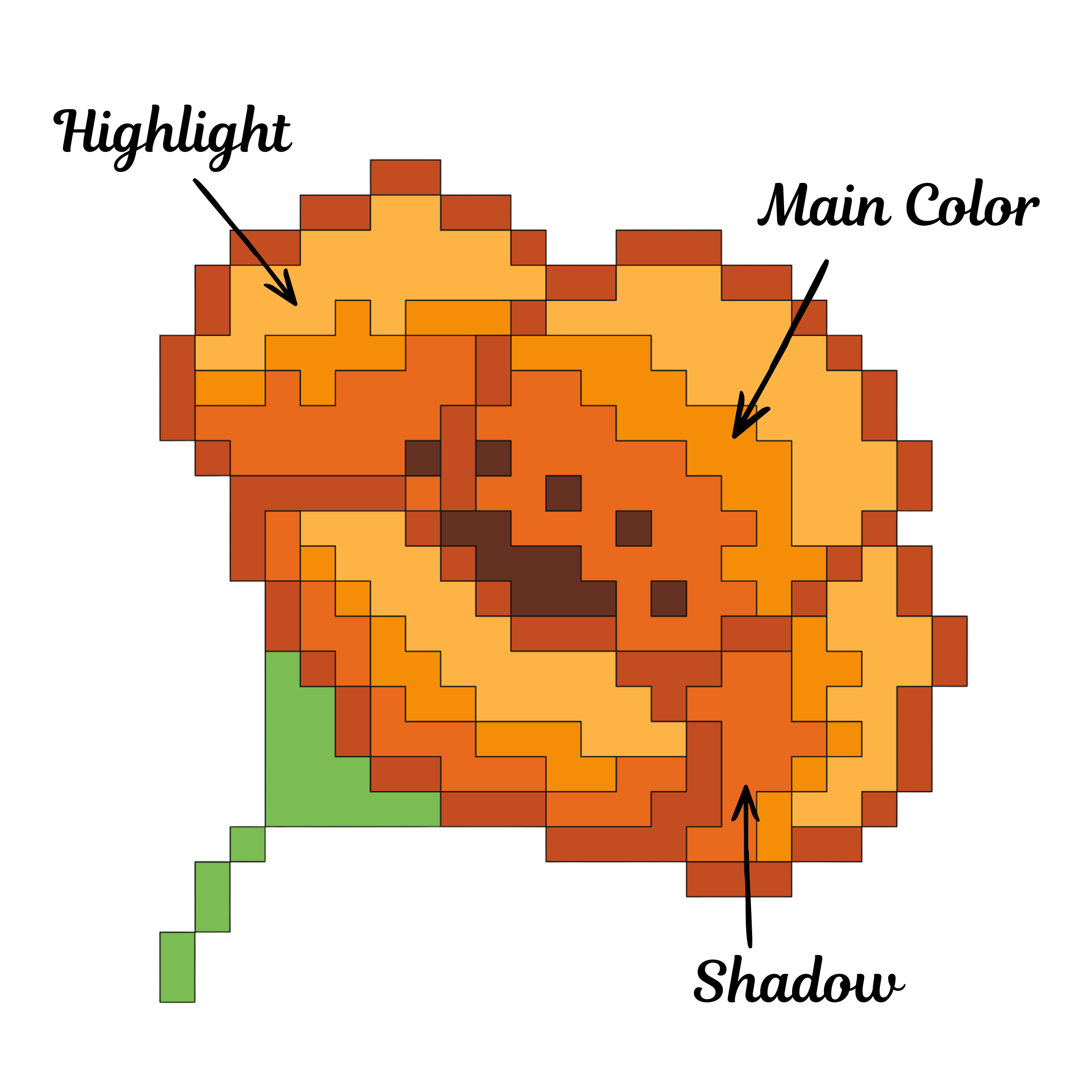
Think of your quilt like a shaded drawing:
Light fabrics = highlights
Medium fabrics = main color
Dark fabrics = shadows
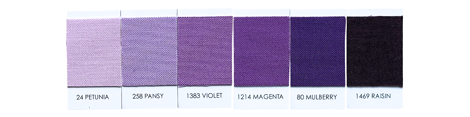
Choose Your Color Family
Start by selecting one main color based on your flower. Sticking to a single color family keeps your quilt cohesive and recognizable.
But here’s the important part— you’re not choosing just one fabric. You’re building a range.
A strong pixel quilt uses multiple values within the same color. Depending on your patterns requirements aim for 3-6 shades:
Very light
Light
Medium
Medium-dark
Dark
Very dark
These shifts are what create dimension in your flower. If your fabrics are all similar in value, they’ll blend together and your flower will lose it’s shape.
Check Your Contrast
This is where most quilts either succeed or struggle.
Lay your fabrics side by side and look closely:
Can you clearly tell the difference between each one?
Do any of them blend together?
If two fabrics look too similar, they will disappear once cut into small squares.
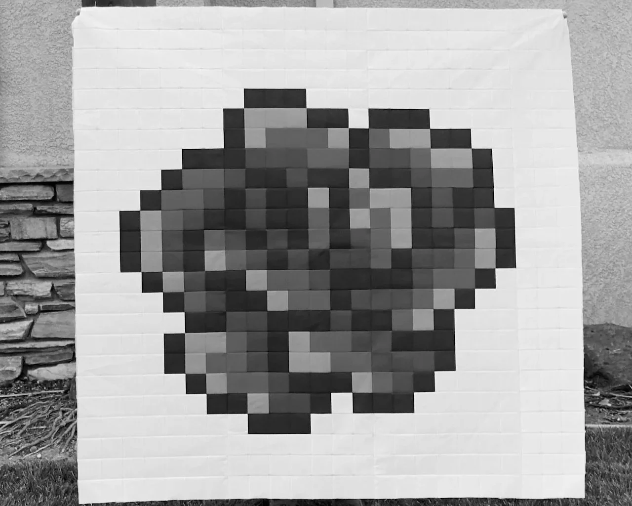
A great way to tell if your fabric pull has enough contrast, is to take a black and white photo. If everything looks like the same shade of gray, you need more contrast.
Creating Soft Gradients (Without Losing Definition)
While contrast is what makes a pixel quilt readable, gradients are what make it feel soft and natural—especially in floral designs.
Real flowers don’t jump from light to dark in harsh steps. Their color shifts gradually, blending from one shade into the next. You can recreate that same effect in your quilt by being intentional about how your fabrics transition.
Instead of placing your lightest fabric next to your darkest, aim for a smooth progression:
Very light → light
Light → medium
Medium → medium-dark
Medium-dark → dark
Each fabric should feel like it naturally flows into the next.
If there’s too big of a jump between two shades, it can create a choppy or blocky look, which can take away from the softness of a flower.
The key is to balance gradient and contrast. Think of it like this:
Contrast = makes the flower readable
Gradient = makes the flower feel soft and dimensional
You’re not choosing one or the other, you’re blending both.
Gradients work especially well across petals and in areas where you want a gentle curved look.
Contrast is important in areas that need definition, like the flower outline or overlapping petals.
If your quilt feels too harsh, look at your trasitions. If it feels too flat, look at your contrast.
The magic happens when the two work together, giving you a flower that’s both clear and beautifully fluid.
Add Depth with Subtle Variation
Even when staying in one color family, a little variation goes a long way.
You can include:
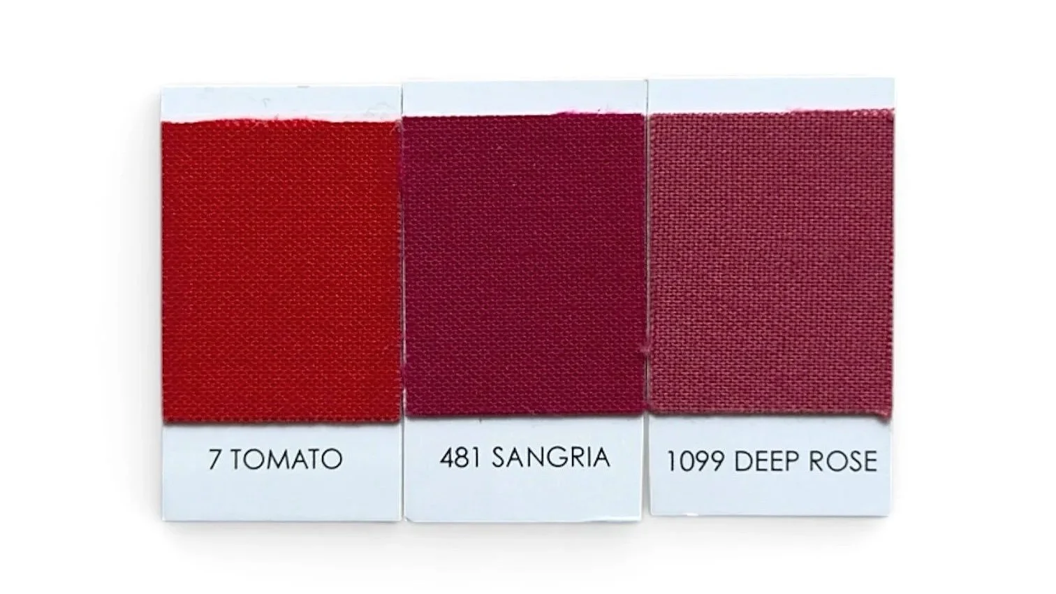
Warm tones (tomato)
Cool tones (sangria)
Muted tones (deep rose)
These small differences keep your quilt from feeling flat and gives it a more natural, dimensional look—just like real flowers.
Choosing Between Solids and Prints
Not all fabrics behave the same in a pixel quilt— and this can have a huge impact on how your final design looks.
Because pixel quilts are made up of small pieces, the scale of your fabric print matters just as much as the color.
Why Large-Scale Prints Don’t Work Well
Large prints might look beautiful on the bolt, but once they’re cut into small squares, they can become:
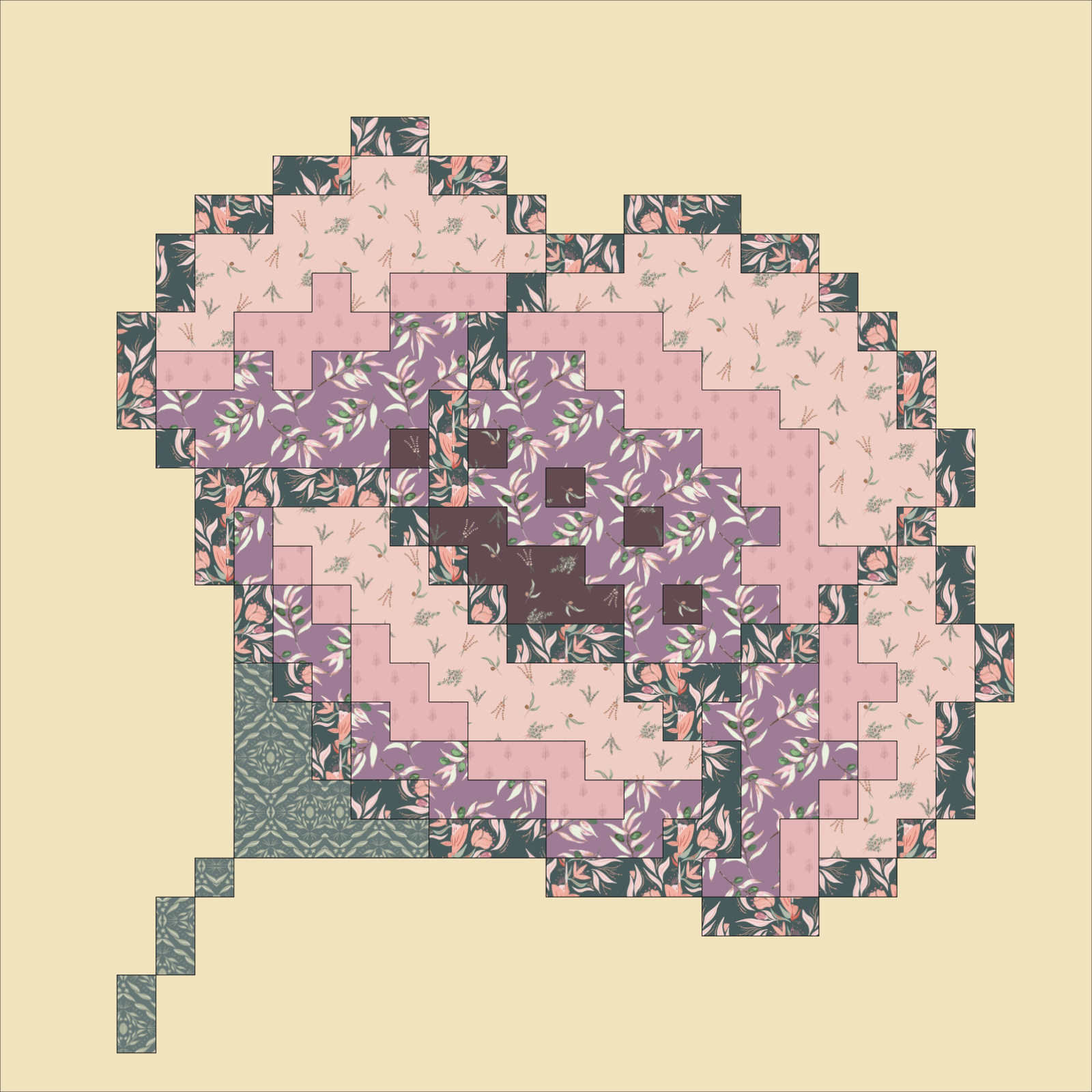
Visually busy
Inconsistent in color
Hard to read within the design
Instead of enhancing your quilt, they can create a muddy or chaotic look where the image gets lost.
This is especially noticeable in pixel quilts, where clarity depends on clean, consistent blocks of color.
A good rule of thumb is if you can easily see multiple colors or distinct shapes in the fabric from a distance, it’s probably too busy for a pixel quilt.
You want your fabrics to read as one color, not compete with the design.
What Works Best: Solids & Small-Scale Prints
For best results, stick with:
Solids
Tone-on-tone fabrics
Small-scale prints
These fabrics read as a single, consistent color—even when cut into small pieces—which helps maintain the integrity of your design.
Mixing Solids and Prints
You don’t have to choose just one!
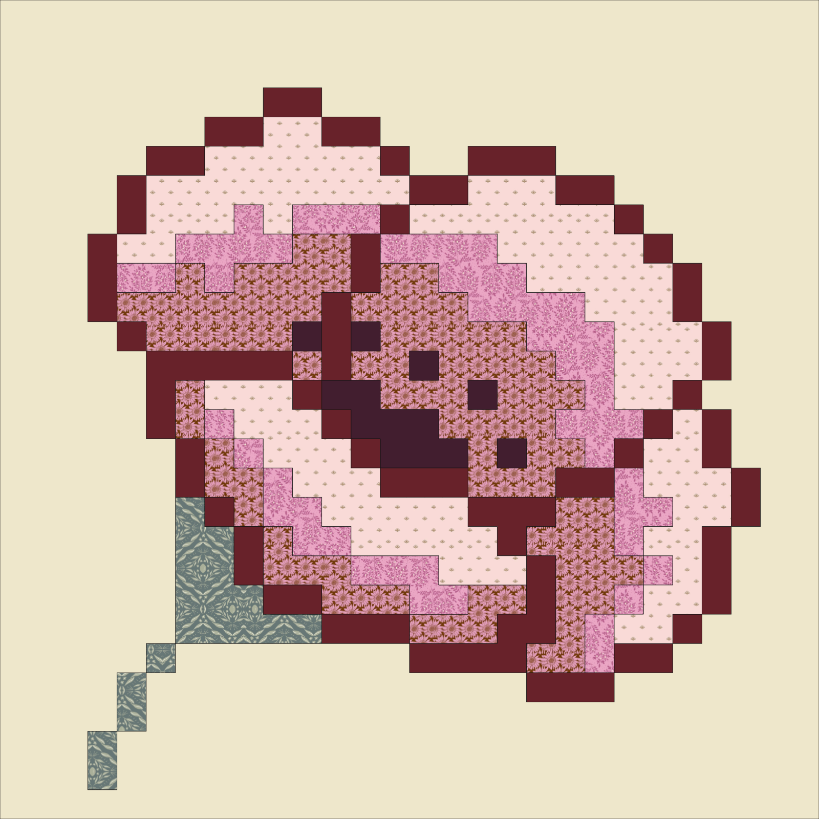
A mix of solids and subtle prints can actually add a beautiful depth and texture as long as:
The value (light/dark) is still clear
The print doesn’t over power the color
If your quilt is starting to look busy or unclear, the issue might not be your color choices. It could be your fabric scale.
Switching to simpler prints or adding more solids can instantly bring your flower back into focus.
Final Thoughts
Choosing colors for a pixel quilt doesn’t have to feel overwhelming. Once you start to focus on value and contrast, everything gets a whole lot clearer.
The more you practice seeing light, medium and dark—not just pretty fabrics— the easier it becomes to create quilts that are bold, dimensional, and easy to read.
If you want to take the guesswork out of it, I’ve made my quilt patterns available on Quilt Ink—a free online tool that lets you digitally color your quilt before you ever cut into your fabric.

On Quilt Ink, you can experiment with different color combinations, test your contrast, and even try out full fabric collections including Kona Cotton and Bella Solids to see what works best for your quilt.
It’s a simple way to build confidence in your fabric choices and make sure your quilt comes together exactly the way you imagined.
At the end of the day, pixel quilts are all about bringing an image to life one square at a time. With the right balance of contrast, and soft, flowing gradients, you really can make your flower quilt bloom.